


Why Howard is rooted in one simple graph
Posted by Possum Comitatus on May 24, 2007

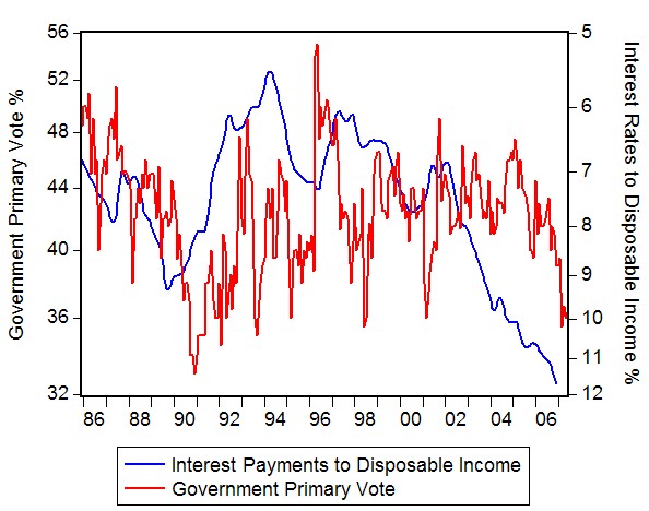
What this graph highlights is the Oppositions primary vote as determined by Newspoll and the percentage of household disposable income that goes towards interest payments from 1986 to today.Notice how they move together?
Their intimacy is fundamentally important to the electoral fortunes of both parties at the coming election.
There are three things that individually or in combination increase the interest payments to disposable income percentage.
1. Interest rate increases.
2. Asset prices increase (meaning the debt needed to be taken out to purchase those assets increases)
3. Disposable income decreases.
For every household in Australia that has a mortgage, at least two, but in some cases all three of these things have occurred in the last 5 years.
Interest rates have increased four times since the last election. Asset prices (but importantly to us here, house prices) have dramatically increased over the last 7 years, thus the size of the debt required to purchase a house has increased, and these two things combined have dramatically increased the servicing costs of that debt you need to buy a house. That is how the size of the interest payment in the ‘interest payment to disposable income’ ratio has increased.
The final part, decreasing disposable income, is where Workchoices is impacting directly upon some households, and where there is a perception that it is threatening to impact upon some other households.
Because the government won’t release the AWA data, we are working in an information poor environment here. However, some things have become apparent.
Some lower income earners are getting reduced take home pay as a result of overtime and penalty rates being replaced with small increases in the basic hourly rate, a key consequence of Workchoices. For many two income households, the second income earner falls squarely into this group. That reduction in take home pay has reduced their disposable income. The interest payments to disposable income ratio is increasing as a result of all three effects hitting them.
This is fundamentally important to households, because households judge “the state of the economy” by what they experience first hand. It is even more fundamentally important to median income households where they don’t enjoy much wiggle room to begin with when it comes to their disposable income.
When interest payments start taking up larger proportions of their disposable income, the actual income that households have left available for discretionary spending decreases. That discretionary spending is what defines the lifestyle quality for many many people. Reducing the money available for discretionary spending effectively reduces the self-perceived standard of living for those households.
This is why Howard’s claims of superior economic management have, and will continue to fall on deaf ears for a large part of the electorate, and it’s why the more he uses that claim, the more alienated that part of the electorate will become.
They don’t see superior economic management, they see reduced discretionary spending, they see their lifestyle becoming unaffordable, they see their costs of living becoming larger as a percentage of their discretionary income, and they see lower living standards (even if its only self perceived) as a result.
They see interest rate rises being a broken promise, house price increases being a pain in the arse and Workchoices being not only an assault on their living standards, but probably the final straw.
When governments tell these people that “they’ve never had it so good” when their personal experience runs to the contrary – they not only stop listening to the government, they become hostile too it.
And this group is large enough to not only change government come election time, they are well and truly large enough to create landslides. If you add higher petrol prices into this mix, the likelihood of a political bloodbath at the next election is almost a foregone conclusion.
Seats with large proportions of middle income, two income households with 1.5 jobs will topple like dominoes.
The interest rate payments to disposable income raw data came from the RBA here:http://www.rba.gov.au/Statistics/Bulletin/B21hist.xls
The Opposition primary vote data came from http://Newspoll.com.au
UPDATE : Thanks to Andrew for pointing out that I cant add up.The graphs are now much more reflective of observable reality.
Here’s how the Government Primary Vote looks against Interest Payments to Disposable Income, with the interest payments scale inverted.
UPDATE II:
The brilliant Simon Jackman has a delicious stats based piece on housing using a clever mortgage stress variable in a regression on 2004 election outcomes over HERE. Well worth a read if you’re that way inclined
![]()

Randal_stevens said
That is an interesting graph mate.
Did you knock it up with the data or lift it from somewhere?
Nice site BTW. (The possum with a bluetooth is a nice touch.)
possumcomitatus said
I put it together this morning from the raw data.I’ve been trying to figure out how to highlight just how important this thing is for a few days now.I think mapping it against the Opposition primary vote from Newspoll does it just the right amount of justice.
Stunkrat said
Nice work. The ALP have been fumbling around a clear communication of that information, whereas that particular picture paints a thousand words (the current equivalent of 10000 Beazly word).
I think it’s important to note that decreases to take-home pay for what I suspect is a vast majority of people has not yet occurred – the other factors most definintely have. Whats-its-face has, for good reason, scared the pants off everyone, so IMO it’s already factored in to the concomitant movement in the polls.
phil said
Oooh that’s good. Well done you. Let’s hope the relevant people see it.
Remote Control said
Distribute that graph far and wide. It is a classic.
Pedro of Canberra said
Great job, Possum. I think you are right on the money.
Figures from 2002 put together by AMP and NATSEM suggested that average annual household expenditure exceeded household income by 2.5%. Not sure what the current data is, but steadily increasing net private sector foreign debt (largely driven by financial sector intermediation of household mortgage debt) makes it clear pretty clear that as a country we are living beyond our means. If the economic times are so good, why is this so?
If someone could do it, I’d love to see something that links falling disposable income to:
a)levels of household credit card debt and personal debt;
b) government expenditure (state and commonwealth) on basic public services (e.g. health and education);
c) trends in commonwealth fiscal transfers to the states; and
d) average household taxation (including GST)as a proportion of gross income.
One thing is sure: the banks have been doing very, very well under John Howard. As the budget papers revealed, the banks are up there with the mining sector in terms of the tax contribution.
But why couldn’t Johnny and Pete give it back either acting like real fiscal conservatives by really cutting taxes? Because if they did anything than was even mildly expansionary (i.e. added to aggregate demand) they would risk an interest rate rise before the election. If that happened then they really would be annihilated.
Catch 22. So much for good economic management. And I haven’t even mention the trade deficit.
They’re stuffed. Our properity is an illusion driven by the real estate boom. For a while there people felt rich. Reality bites.
Great site, by the way. I’ll definitely be coming back.
Pedro of Canberra said
Possum
Just a suggestion: your graph might look better if you plot a 3-poll average (it’ll smooth it out a bit). Aussie Bob at Surfdom does this and it works well.
Cheers.
swio said
Impressive piece of work. I have been thinking about the effect of higher house prices on people’s standard of living. That’s a very nice way to express it.
It would also be interesting to think of in terms of generations. It would be interesting to look at statistics on home ownership rates for under 30’s for example. I have a feeling that a graph of this would leave you calling them the “Dreamy” generation because the possibility of living the great Australian dream of owning their own home is realy is just a dream for many in this group earning below the median wage.
Unfortunately neither side of politics, or the experts have a solution for this problem.
Andrew Norton said
Your RBA link doesn’t match the RH scale – interest payments were 11.7% of disposable income in their last data point. They would be much higher in households with mortgages of course.
possumcomitatus said
Thanks Andrew.
My smoothing process knocked a few numbers around towards the end and stuffed up the forecast values from December into March. I’ve fixed it up now using the raw data, and leaving the Jan,Feb and March forecast figures out.
possumcomitatus said
Pedro, On linking disposable income, or better, household discretionary spending budgets to debt, government expenditure, tax/welfare interaction etc.I completely agree. Big job though, and not many outfits around the country with the capability to do it properly.
As for the banks, why oh why we still persist with the anachronistic policy of the big Four is beyond me.The banks are big enough to move out of the sandpit and play with the grown-ups, they don’t need statutory hand-holding by the government.
Howard and Costello have really got themselves into a fiscal pickle with the housing market. Their front loaded subsidies like the first home buyers grant (which did nothing but build the value of the grant into house prices anyway – duh! Whoda thunk it!) and the 1998 Capital Gains Tax changes being allowed to run in conjunction with a virtually open ended negative gearing arrangement just pumped investor demand and bid up prices. Now they find themselves in a position where they cant give big tax cuts or engage in any type of meaningful income tax reform because interest rates will rise to some extent, house prices will adjust downward, and great armies of recent home buyers and middle class wannabe property tycoons will find themselves up shit creek as they discover the meaning of negative equity and variable capital costs.
So we’re left with a government running huge surpluses, trying to manage demand by fiscal policy (which is cute if you wear a tweed jacket and you’re into that whole 1960’s economic vibe) in a futile attempt to protect the mortgage market from the consequences of an asset price boom hangover, a price boom that the government itself exacerbated with its idiot tax policy arrangements.
As far as the smoothing of the graph line goes, I cant really smooth that data too much simply because of the time periods involved with the volatility. Simple moving averages doesn’t really make the thing pleasing to the eyeballs becaue you just end up with strange looking bumps. There’s 258 observations there.3, 6, and 12 month moving averages don’t actually make it easier to look at, and moving averages larger than that not only start to reduce the information contained in the graph, but start to reduce the relationship between the two series. I guess the important things aren’t meant to be pretty or something.
Swio, funny you should mention that as I plan to write something about that very issue and a policy approach that could be used to improve housing affordability without being too politically unpalatable. Its mostly about changing the Capital Gains Tax/negative gearing nexus and actually using negative gearing to boost supply incentives. But that’s for another day soonish.
Andrew Norton said
The numbers on the RH scale still look wrong. I don’t disagree with the general assumption that even with self-inflicted debt problems some people will blame the government. But I don’t think graphs like this can tell us what we need to know. We need more detailed information about households in financial distress. The General Social Survey data released by the ABS this week has some of that.
EconoMan said
Possum, I think you could separate the graph to the pre and post 1996 period. IMO, the primary vote for the ALP and the Coalition are different beasts. For the parties to be 50/50 on a TPP, the Coalition needs a higher primary vote for pretty much any reasonable preference flow.
Also, The link is a little weak at times. Have you done any testing?
possumcomitatus said
Andrew – Those numbers are just straight annualised numbers right out of the the RBA B21 dataset.There is a funny spike at the end, but that’s just the result of the the jump in the annuallised value that derives from replacing the Dec05 value of 10.6 with the Dec06 value of 11.7
Pedro of Canberra said
Possum
I hadn’t considered the follow on impact of an interest rate rise on the housing market itself. Bad sh*t.
The worst thing is, even if anyone on the Labor side understands this story, they can’t use it politically. What can they say: the Government has taken you hostage to interest rates, the situation is more dangerous than anyone is ackowledging, but trust our man “Steady Hands” Kev the fiscal conservative to defuse the bomb? An impossible sell.
Actually – it’s the same with Iraq. The government has gotten us in an impossible situation, and now are arguing that the consequences of withdrawing justify us continuing to put faith in them. Amazing stuff.
On interest rates – it all comes back to your graph. Even if the punters don’t get who’s responsible for this, they are feeling the pain. One just hopes that in the final analysis, it’s not a case of Helsinki Syndrome.
Andrew Norton said
I see what you are doing now – you are adding four quarters to get an annualised figure when you should be averaging the four quarters. Nearly two-thirds of households don’t even have a mortgage, and less than a quarter owe more than $100K, so it is simply impossible for interest payments to be consuming nearly half of all disposable income.
Jack Strocchi said
Comment by Andrew Norton — May 25, 2007 @ 2:35 pm
Sure but arent the swinging voters in mortgage belt marginal seats likely to be the big mortgagees? They are the ones who become marginal voters because they are under financial pressure and trying to squeeze a better deal out of the govt. That is why political parties court them so assiduously.
Voters not under financial stress can afford to be rusted on (“true believers”) or vote with their heart on their sleeve (“doctors wives”).
possumcomitatus said
Economan @13, The primary votes are different beasts indeed, yet what I’m attempting to highlight is the general relationship between the two series in terms of their movements despite the party of opposition. You’re right about strength of the relationship not being constant. It’s consistent over any long enough time period, but its certainly not constant in either its strength or the period of time it seems to affect the oppositions primary vote.
The interesting bit for me is the period from the recession until the 96 election. If Hewson didn’t lose the “unloseable” election, the two lines would have tracked each other intimately across that period where the relationship between the two series looks weakest.
On the strength with testing, if we call interest payments to disposable income IPDI,
From 86 to 93 using a basic autoregressive model of
Opprimary = beta0+beta1[opprimary(-1)] + beta2[IPDI-IPDI(-6)]
Which accounts for a 6 month lag effect, the results are beta2= -1.4 with a STD error of 0.42 a t-test stat of -3.3 and a Prob value=0.001
That’s a strong relationship, even if the variance is largish.
From 1996 to 2001 using the same equation we get:
Beta2= 2.7 with a STD error of 0.9, a t-test of 2.92 and a Prob value= 0.005.
Again, a strong relationship.
From 2001 to the present but this time substituting the beta2[IPDO-IPDI(-6)] with just a plain old 12 month lag value of IPDI(-12) we get Beta2= 0.37 with a prob value =0.05.
Which is a good relationship considering the Mark Latham poll spike threw a spanner into the works.
possumcomitatus said
Pedro @15,
The opposition would find it hard to use, especially as interest rates are positively correlated with the Coalitions primary vote, that is the Coalitions primary vote has historically increased with higher interest rates and decreased with lower interest rates.This gets back to what I’ve been saying elsewhere, bad economic news (or threat thereof) is good for the coalitions vote, while economic sunshine lowers there vote.
Elsewhere on the blog I’ve given details of how those relationships statistically play out, I think here
Impressed person said
Gotta say this is one of the best blogs ive read, every new entry brings out an angle I haven’t considered before, top work!
Peter Tucker said
I am a great admirer of this blog and all the analysis. I have no truck with the general message of this thread, but I have to make one comment: at the very start, Possum states, in relation to the ALP primary vote/interest payments graph, “Notice how they move together?”
Do they? Maybe it’s my eyes, but I reckon if I drew a trend line on the ALP primaries, it would either be flat, or slope slightly downwards from left to right (and it definately would without the Rudd spike right at the end). A trend line on the interest payments would slope upwards. Statistically, and I am no statistician so I am probably getting myself into serious trouble, there may be some positive correlation between the two, but can it be said they “move together”?
James said
What is the ALP victory index at?
simply click for source said
This design is spectacular! You obviously know how to keep a reader amused.
Between your wit and your videos, I was almost moved
to start my own blog (well, almost…HaHa!) Fantastic job.
I really loved what you had to say, and more than that, how you presented it.
Too cool!
refrigerator repair help said
Ah, our refrigerator is on the fritz. It turned out doing this on again/off again tapping noise from the back throughout the day & then little by little stopped maintaining items frosty.
Im quite certain its the compressor, start relay or
even fan.
Anyone know of a good (also truthful) repair service or maybe handy-man that’ll make house calls to the westside of city?? We cant bring it at anyplace cause the lady & I either drive motor vehicles. Im truly positive it simply should have a whole new component.
I’d hate to purchase a new one cause it really
is an extraordinarily nice refrigerator. Thanks!
Homepage besuchen said
Hmm it appears like your site ate my first comment (it was super long) so
I guess I’ll just sum it up what I submitted and say, I’m thoroughly enjoying
your blog. I as well am an aspiring blog blogger but I’m still new to everything. Do you have any suggestions for inexperienced blog writers? I’d genuinely appreciate it.
Berita Korupsi said
Terima Kasih Atas Informasinya
無修正 said
Hiya, I am really glad I have found this info. Nowadays bloggers publish only about gossips and
net and this is really irritating. A good website with exciting content, this is what
I need. Thank you for keeping this website, I’ll be visiting it.
Do you do newsletters? Can not find it.