Well maybe not, but it’s going to be a lot, lot closer than most people realise.
We are talking of course, about the most South Eastern seat in Qld, based around the area of the southern Gold Coast. For you Mexicans reading this that rarely get above the Rio Tweed, let me introduce to you McPherson:
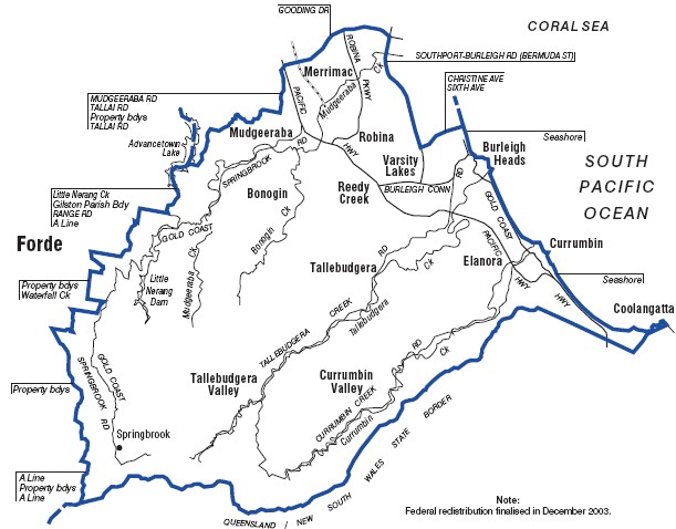
This map is proudly brought to you by the AEC via Parliament House.
For more info, Adam Carrs exceptional site has the rundown on it HERE plus many other glorious tidings to boot.
McPherson is currently held by Margaret May and is firmly embedded in the Liberal Party safe ‘list’, being held by a margin of 13.9%.
But not all is as it seems with this seat. The demographics are changing rapidly, and so with it the politics.
First, an overview of the demographics where we’ll compare the 2001 census results with the 2006 variety. This can only come about at the moment due to the great work of George “Meganomics” Megalogenis (voted Journo most likely to become a Greek porn star) over at The Oz who collated the 2006 census data for us to use. George, you’re a champ.
The Median income of McPherson in 2001 was $786 pw (the 122nd highest) whereas now its $864 pw (the 74th highest).Quite a move up the old income ranking.
Obviously something has changed for that to occur – and that change is families with rugrats (or having aspirations of rugruts) that buy houses.
In 2001 Couples with dependent children made up 32.9% of the electorate (132nd highest) but now make up 41.6% of the electorate (118th highest).
The proportion of the electorate paying off their home in 2001 was 22.1% (105th highest), now its 31.1% (80th highest).
So far, that’s all good and well. It tells us that the demographics have changed a fair bit since 2001 with a lot more families or ‘families to be’ moving into the seat and buying houses. As they came in, they pushed the median income up along with the proportion of the electorate paying off their home.
But what makes this seat particularly interesting is the composition of that group of blow-ins.
The current median household income for those families in McPherson that are paying off a home is $1495pw ( 86th highest) while the median home loan repayment is $1500 per month (44th highest).
That makes the Mortgage Burden (calculated as the median home loan repayment divided by the median household income of those families with a mortgage) a whopping 23.2%.
That gives McPherson the 11th highest mortgage burden in the country. Of the ten seats with a higher mortgage burden than McPherson, 8 of them are held by the ALP on margins of greater than 6%, one of them held by the ALP with a margin greater than 3% and only Greenway at number 9 is held by the Coalition.
So what makes McPherson so special that despite its mortgage burden, it’s so naturally inclined to be Liberal?
Well its not – and the population of McPherson is becoming more Labor oriented as time progresses.
If we look at the State electorates that make up McPherson – Burleigh, Currumbin, Mudgeeraba and Robina we find that the ALP at the State level hold two of those seats with the Libs holding the other two. But what’s important here is how the vote in those state seats has changed and continues to change with the demographic movement.
In the 2006 election, the Beattie government had a swing against it while the Liberals had a 1.6% swing to them. Yet in these four seats, the ALP vote increased in all of them.
Comparing the ALP TPP vote from the 2004 State election to the 2006 State election:
Burleigh went 55% to 58.3%
Currumbin went from 46.8% to 47.8%
Mudgeeraba went from 51.85% to 52.9%
Robina went from 41.2% to 47.5%
All seats swung to the ALP despite the overall state swing against the ALP.
I whacked the numbers from the State seat booths into the McPherson booths, and if the population of McPherson voted federally in the same way as they vote at the state level – the result would be somewhere between 52-48 for either party.(I say either party as there was a little bit of booth mismatch creating uncertainty and I made the assumption that the pre-poll and postal votes would flow to the Coalition 2.5 points higher than the broader electorate… which seems to fit the pattern of this type of seat elsewhere in Qld).
So far from McPherson being demographically Liberal – it’s arguably more demographically Labor than Liberal. Far from the denizens of McPherson being rusted on Coalition supporters, they are far more non-aligned than the 13.9% margin suggests, with the voters of McPherson having elected ALP representatives at the state level and with increasing amounts of them voting for Labor at the state level. That suggests to me that McPherson has become swinging voter central, with an increasing level of Labor base support.
What is also interesting is the numbers of people that are moving into the electorate. If we go over here and check out the enrolment stats for McPherson we find that:
In October 2004 enrolment was 83,820
In June 2006 enrolment was 83,022
In January 2007 enrolment was 87,205
In July 2007 enrolment was 90,415
By the election this year, that will likely have increased by another 3 thousand people to be an electorate 11% larger in enrolled voters than it was at the last federal election, with nearly all of that population growth being new urban development.
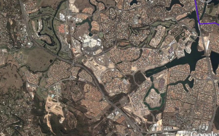
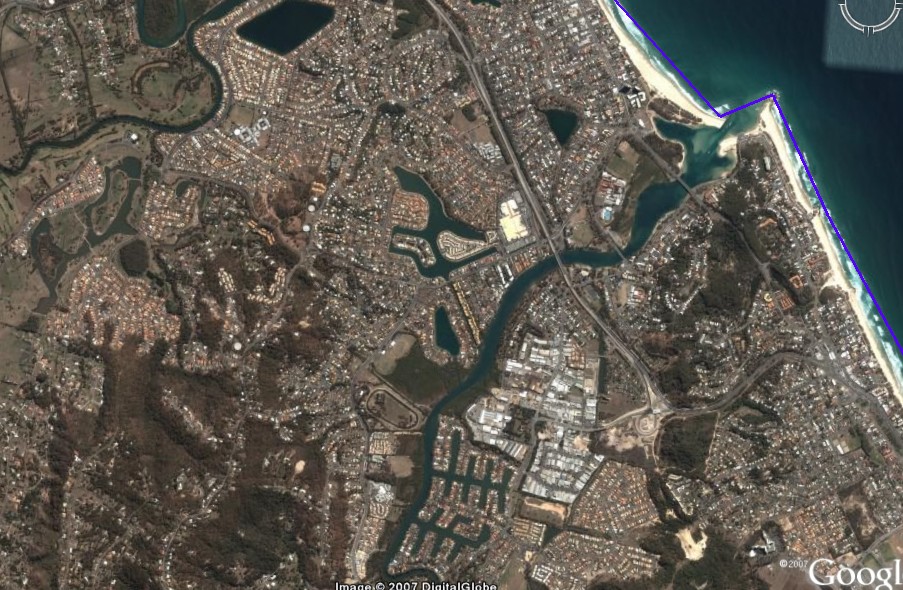
And we know where they’re moving too and why they’re moving in such large numbers– anyone that drives through the electorate cannot but miss the vast new tracts of suburban Lego Land opening up. To give an idea, I’ve pulled some shots out of Google Earth of McPherson. I’ve pencilled in the electoral boundaries with a blue line (just click the thumbnails to blow them up).
McPherson North
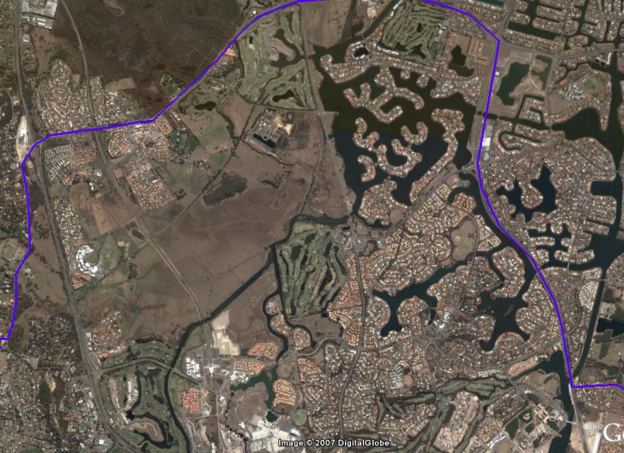
McPherson Central
McPherson South
This seat is simply not as safe as it looks. Last election, the increased population in the new urban developments would have been, in demographic terms, prime target number one for the Coalitions interest rate campaign strategy. New home buyers moving into this area before the last election and swinging against the ALP at a level higher than their normal inclination would have hidden the actual demographic shifts and the subsequent political shifts that McPherson has been undergoing.
Qld swung as a state by 2.2% towards the Coalition at the 2004 Election, yet McPherson only swung 1.4%. Even the interest rate campaign aimed at mortgaged up new home buyers that are rapidly filling McPherson couldn’t prevent the seat from swinging less than the state average.
But not this time.
When you combine this with the growing number of lowish income, young service workers populating the seat via the rented townhouse developments, and which service the booming retail and tourism industries of the Gold Coast (read Workchoices) – this seat faces a perfect storm.
The politics of interest rates, Workchoices, and the nexus between those two issues, “interest payments to disposable income” and reduced discretionary spending budgets that flow from it (remember its discretionary spending budgets which fund lifestyle and self-perceived standards of living, not disposable income) will unleash the changing demographics of McPherson on the Coalition vote.
This seat will swing, and it will swing big simply because it will be catching up with its own demographic dynamics.
![]()